
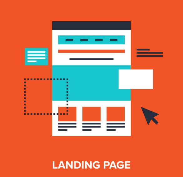
Landing pages are key elements of your website. The proof: when a startup launches, it is often the first (and only) part of the website that is developed and put online. If you are a marketer, you have known this for a long time: the basis of your purchasing journey remains above all your product. So How to Create an Effective Landing Page?
So how can you ensure that your landing pages effectively convert prospects into customers? Here is a short definition and our advice for boosting the conversion rate of these essential pages.
In this article, we will see:
- The definition of a landing page
- Our advice for creating an effective landing page with examples
1. What is a landing page?
Definition
A landing page is a page on your website created with the aim of converting those who visit it. From visitors to prospects, from prospects to qualified leads… It acts like a piston propelling visitors from one stage of their journey to the next, based on your needs and its positioning.
In inbound marketing, landing pages are very often used to offer, at key moments in the journey, high value-added content in exchange for information .
With Plezi in particular, it is easy to create “drag & drop” landing pages to maximize conversion rates: no need to know how to code!
Goals
Your conversion rate is undoubtedly, as a marketer, one of your biggest concerns. This is where landing pages take on their full value: their primary goal is to maximize the conversion of your web traffic to create an effective landing page.
A prospect arriving on a landing page must want to carry out the action you are proposing: request a demo, register for a webinar, create an account… Your challenge, then, is to be as clear as possible. To increase your conversion rate, you need to get straight to the point… and know your marketing funnel (or conversion funnel).
Depending on your user’s journey, you must be able to present your offer to them in the most effective way possible. It’s up to you to know, based on the positioning of your landing page, in which phase your prospect is. Should he be attracted? Convinced ? Is he in the purchasing phase?
Knowing your audience well is also essential. Stripe , for example, does this very well. In their landing page presenting their Connect offer, they take the time to expand on elements that answer the questions of their visitors who are in the attraction/conversion phase.
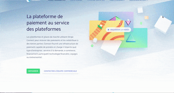
If the visitor is not convinced by the first visual, the video and the calls-to-action, Stripe develops an argument responding to their main personas in the attraction phase (with more specific calls-to-action):
- their functionalities and direct benefits;
- answers to legal and financial questions;
- extracts from their technical integration in open access.
2. Create an effective landing page
Concretely, what are the best practices to follow to create an optimized landing page, with (almost) guaranteed conversion?
The most effective is to try to respond to the four stages of your marketing funnel with the different elements of your page according to their positioning. At each of these stages, monitor your conversion rate to better understand where you are particularly effective… and where you need to improve. Here are our tips for creating an effective landing page.
2.1 Hook with a powerful punchline
Prefer a short and catchy title
Your goals here:
- grab attention at a glance
- make your visitor want to read more.
For this, the title of your Landing Page must reflect the value proposition proposed . Is he here to discover the product? This is the time to put in big, bold and underlined (well, almost) what your product does or what you offer. Is your prospect here because he clicked on a CTA (call-to-action) promising him a webinar? Reassure him and show him that he was right to ask.
Note : web text means SEO (Search Engine Optimization). Don’t forget to check that your Landing Page does not suffer from a lack of natural SEO optimization based on your main keywords. If you have them, don’t also neglect your title tags, meta description and tree structure (H1, H2, H3, etc.).
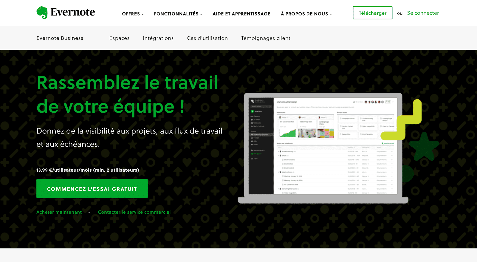
Evernote , in their BtoB offer, explains in 2 sentences their value proposition to direct visitors towards a free trial (their best argument to promote conversion).
2.1 Explain the value proposition in a few words
Optimize your layout and UX design
The layout (also called UX design) of a landing page must be attractive but not distracting. Offer a clean design to focus your users’ attention on the essentials and to create an effective landing page.
Feel free to remove the navigation menu – and keep all the important elements above the fold.
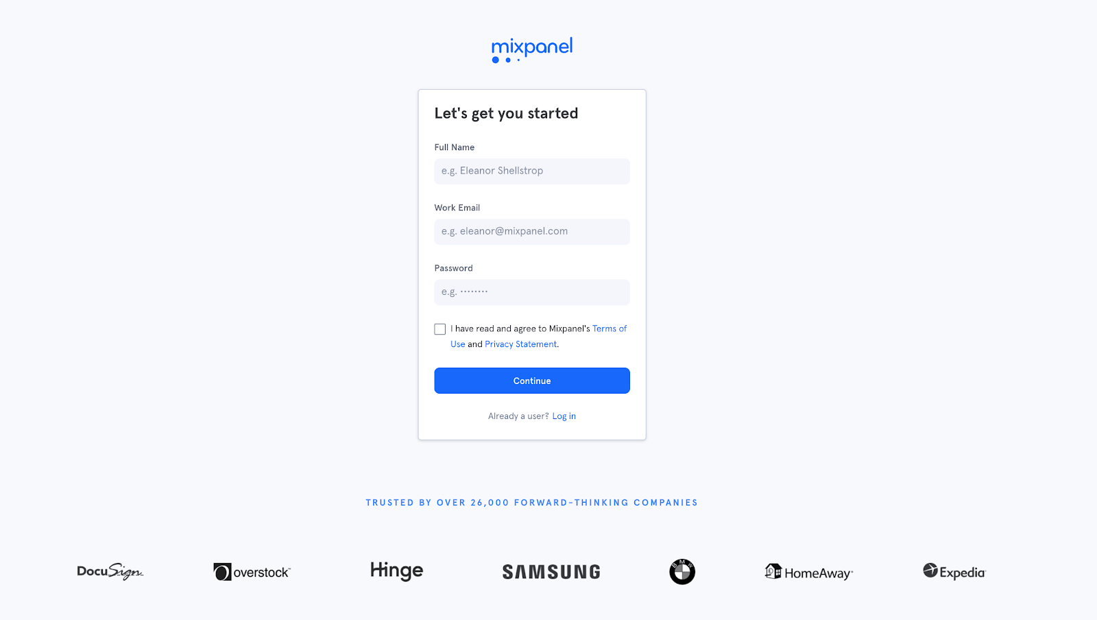
Mixpanel makes account creation a clean and simple experience: no more navigation bar, a simple form and a few customer logos.
Choose a consistent visual
The graphic appearance of your landing page can help with conversion . A beautiful photo or illustration can enhance your offer, provide visuals of your solution and support your speech. Video can be a strong argument: it can multiply the conversion rate of your landing page by 4 !
Also make sure that your visual is responsive and adapts to all screens. Nowadays, 53% of internet traffic is done on mobile : impossible to miss.
Here again, don’t forget the two steps of image SEO:
- work the “alt” tag
- compress the image as much as possible for minimized loading time.
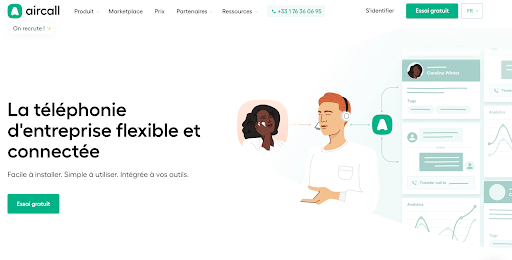
Aircall , a calling solution for businesses, has mastered this visual aspect very well, which they maintain throughout their pages.
Showcase the benefits… without spreading yourself too thin
Convincing your prospect that they are embarking on something completely worthwhile is your first goal. To do this, you must respond to their issues: what do you know about their persona and their needs at this stage of the conversion tunnel?
Here too, there is no need to write a novel: a few well-presented bullet points should be enough. Don’t waste it on reading time!
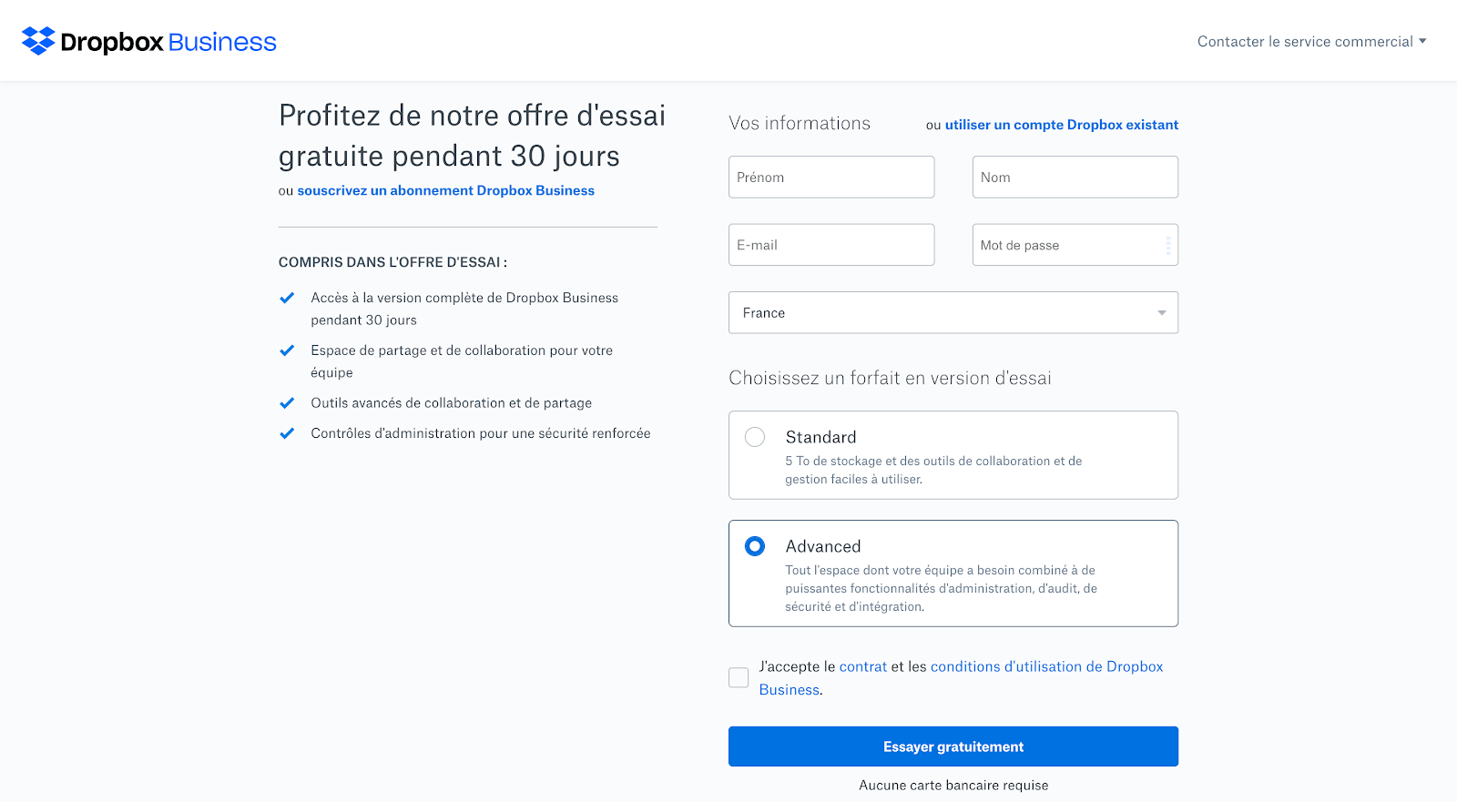
Dropbox business presents the great benefits of its free trial and even answers any questions you might have at this stage of the journey.
3. Reassure and convince your customers
3.1 Highlight your figures
If you can, highlight your figures to help you convince and support your speech. Depending on the stage of the conversion tunnel, the figures proposed may be different: customer satisfaction rate, expected technical performance, etc.
Zendesk hits very hard on its landing page presenting one of its offers, the “support suite”. Thanks to a form-type tool, you can fill in information about your team and see live the performance you could achieve with their solution, based on a customer benchmark. It’s the perfect conversion tool!
3.2 Highlight your customer testimonials
Nothing better than a quote from a customer to reassure your prospects. Quotes, logos or more in-depth case studies, they help to reassure and convince , especially if the examples offered are in the same industry as that of your visitors!
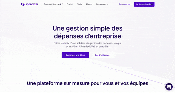
Depending on your page and its positioning in your prospect’s purchasing journey, be ingenious: place a few logos at the bottom of a demo request form, reserve inserts for extracts from customer cases on a crucial stage of the purchasing phase, or slip customer quotes next to your key features like Spendesk does .
Landing pages are valuable allies for converting and supporting your prospects throughout their purchasing journey. By optimizing and adapting them as best as possible to your marketing targets, you will increase your results tenfold!
3.3 Answer questions asked by your prospects directly
The key to good marketing is to respond as closely as possible to the questions your prospects are asking. What if the best way to do this was to simply add a chat window to your website?
You can either opt for the discreet “available if necessary” method or directly engage visitors with automatic messages. The advantage is that you can personalize and automate everything by coupling the Crisp chatbot with c2m , for example .
4. Convert!
4.1 Propose a powerful call-to-action
The calls-to-action (or action buttons) of your Landing Pages must be the most visible element of your page after your title. For this, they must be well placed, attractive and eye-catching.
Forget formulas that we no longer even read like “complete the form” or “continue”: clearly explain what action will be carried out to reassure your visitor and make them want to click.
Also be careful not to place your CTA below the fold (the limit of visibility of the screen): if your user has to go down to your page to carry out their action, you risk not promoting the conversion of your landing page.
Alan , the startup revolutionizing mutual insurance companies, has a remarkably effective Landing Page. Its call-to-action brings together form and action button in one! A first CTA is present at the top right of the screen, but, by filling out the very attractive form, a new button is generated, taking you directly to an adjusted proposal and explaining to you how their solution adapts to your particular case.
4.2 Set up a suitable form
At Plezi, we use intelligent forms : instead of answering (too) many questions at once, your prospects provide information in several stages depending on their maturity. Thus, your collection is enriched as you interact with your prospect.
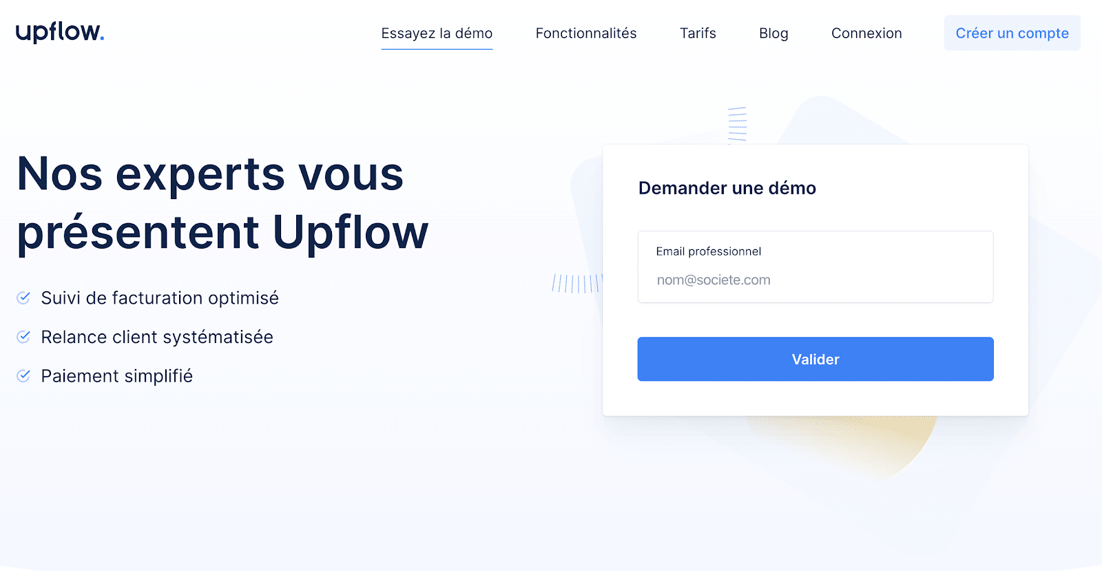
Upflow , a solution for managing customer invoices, only asks for your professional email in their demo request landing page. At this stage, you don’t need much more!
Don’t forget to analyze the conversion rates of your landing pages, otherwise you’ll miss one of the best indicators on your site!
At Plezi, we have noticed that good landing pages – or, in general, pages whose primary goal is to convert – must guarantee you at least a conversion rate of 10% .
If this is not the case, it’s up to you to look at where and how your page can fail. To monitor your performance, test different pages (A/B testing) with slightly different wording, visuals or CTAs. You can also install heatmaps like Hotjar to better understand your users’ on-page behavior.
Sometimes, however, the problem does not come from your landing page but from a lack of consistency in the customer journey . Ask yourself: how do your users get to this page? With what promise? Are you really meeting their needs? By thinking about the overall journey, you will be able to offer, from the hook to the thank you page, a pleasant and engaging experience to your prospects.


